The Language of Color in Your Pilates Studio
Color is not something we just see—it’s something we feel. It exists in memory, in sensation, in the way a room can feel warm before it’s even heated or cool before the windows are open. In the world of Classical Pilates, the method is precise, the design timeless and intentional, and color is what awakens the room and gives it its unique spirit.
At Gratz, we understand that every studio—whether it’s a home vibe or a studio city center—has its own language, rhythm, and presence. Color plays a foundational role in shaping that atmosphere, inviting your clients into a sensory experience that begins before they ever get on something like the Reformer.
Color as Light, Feeling, and Form: Why Upholstery Color Matters for Your Pilates Studio
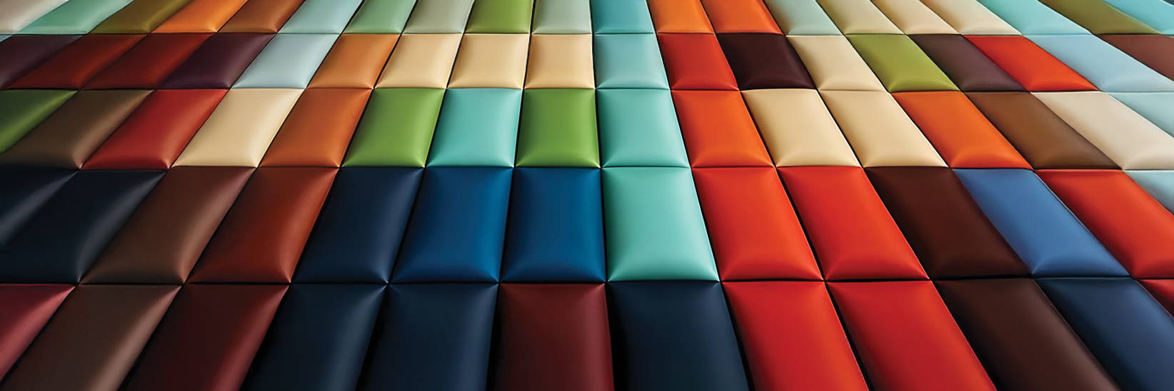
Color begins as light—measured in nanometers and numbers, each wavelength striking the eye with a different tone. For example, violet and blue sing high and cool. Yellow and red stretch low and warm. Greens rest quietly in the middle, a blend and breath between extremes.
But color isn’t just about science. Light alone doesn’t shape a room or a mood until it meets a surface. That’s where color becomes language—a silent storyteller that sets the scene before a single movement begins. When someone steps into your Pilates studio, the first thing they feel isn’t your technique or your voice. It’s the atmosphere—the way the space welcomes them, calms them, or energizes them. Color affects how light dances across the room, how shadows deepen and soften, and even how every moment is captured in a photograph. It adds texture and depth, inviting each practitioner to connect. Color sets the tone long before you cue a breath or adjust a spring.
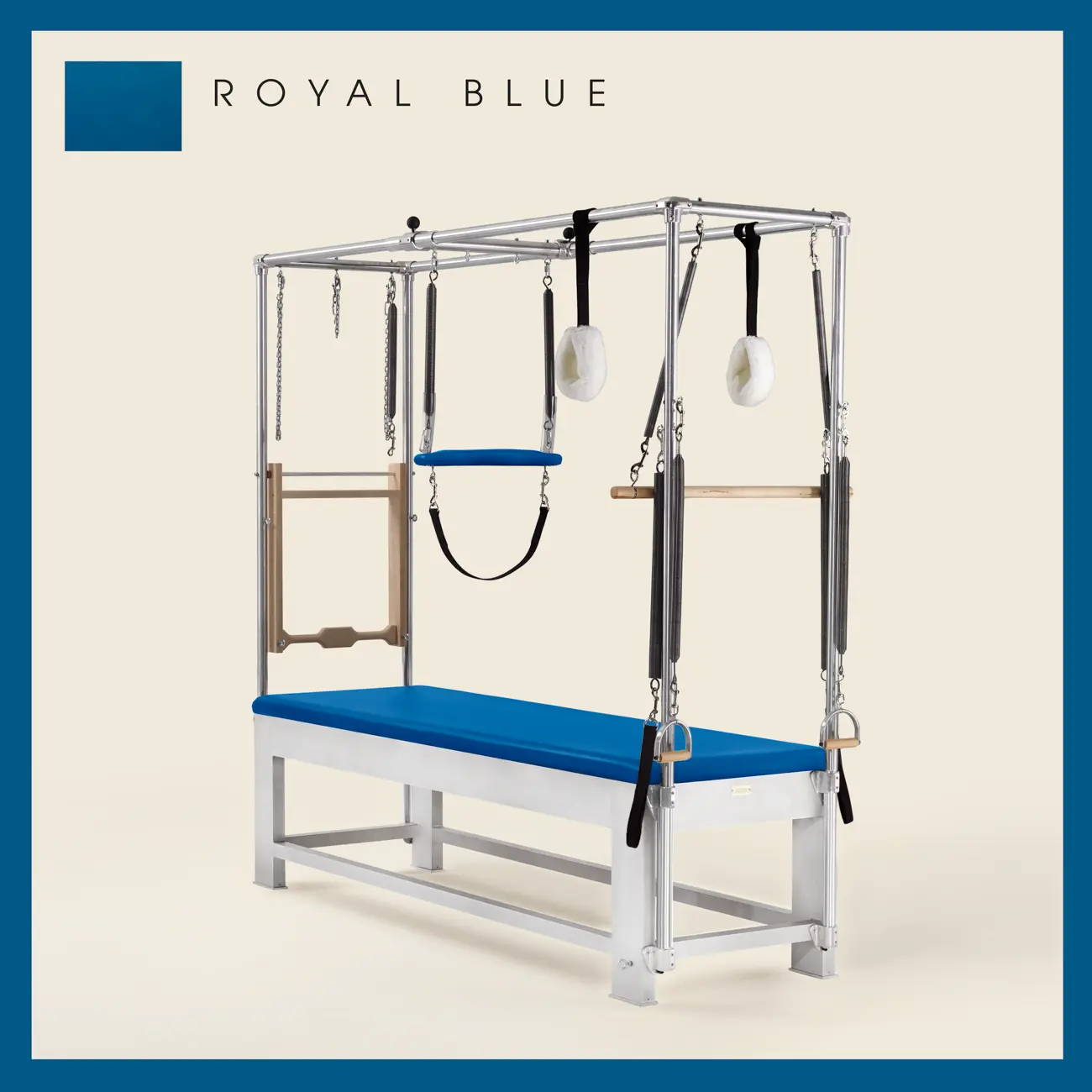
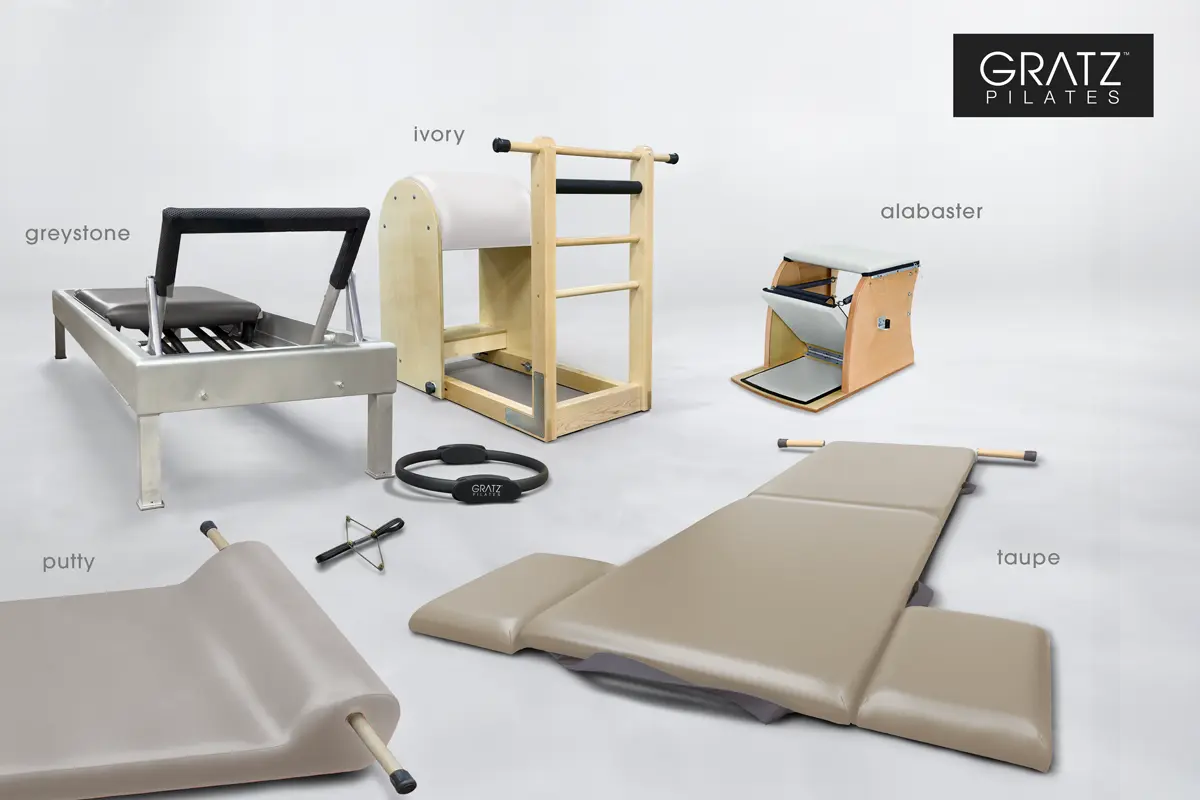
What story does your studio tell through its colors? Is it a neutral sanctuary—where black upholstery brings timeless elegance and a quiet strength? Or a gentle place for healing, where soft pastels like sage or gray moss offer calm and reassurance? Maybe it’s a community space, grounded in warm neutrals like taupe and greystone, encouraging connection. Or a bold statement of identity, where royal blue or American Beauty speaks confidently of your brand’s spirit. Perhaps you lean into tradition, with classic bristol or regimental blue, evoking calm focus and respect for the method similar to Joseph Pilates’ own studio.
Let’s explore how these choices unfold further in different studios, where colors combine and converse to create spaces that are as intentional and alive as the practice they hold.
1. The Minimalist Sanctuary
Colors: Ivory, Taupe, Alabaster, Graystone
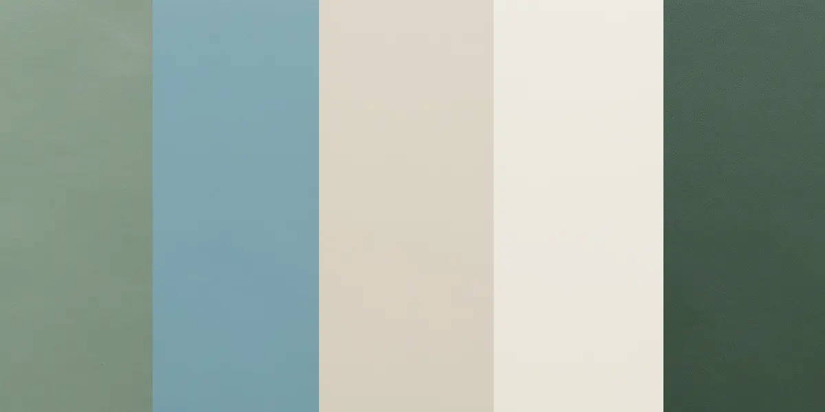
2. The Calming Cool Combo: Dusty Jade, Wedgewood, Alabaster, Adobe White, Yew Green
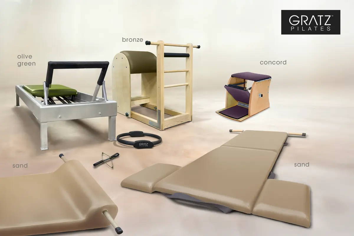
3. The Heritage Atelier
Colors: Olive, Sand, Bronze, Concord
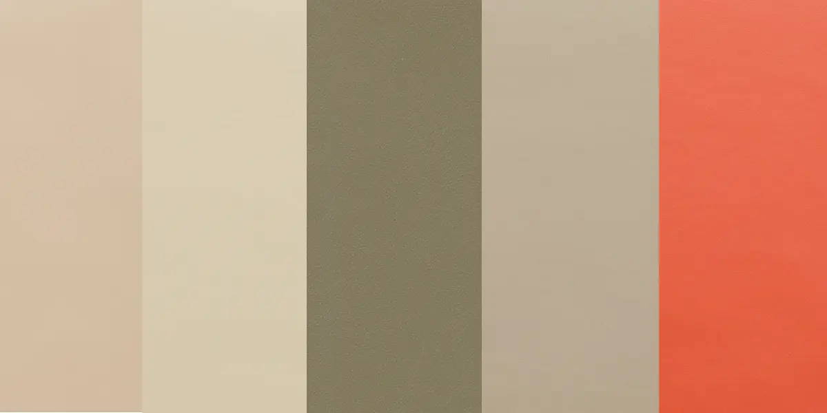
4. The Warm Minimalist Combo
Colors: Sand, Parchment, Bronze, Taupe, Mandarin Orange
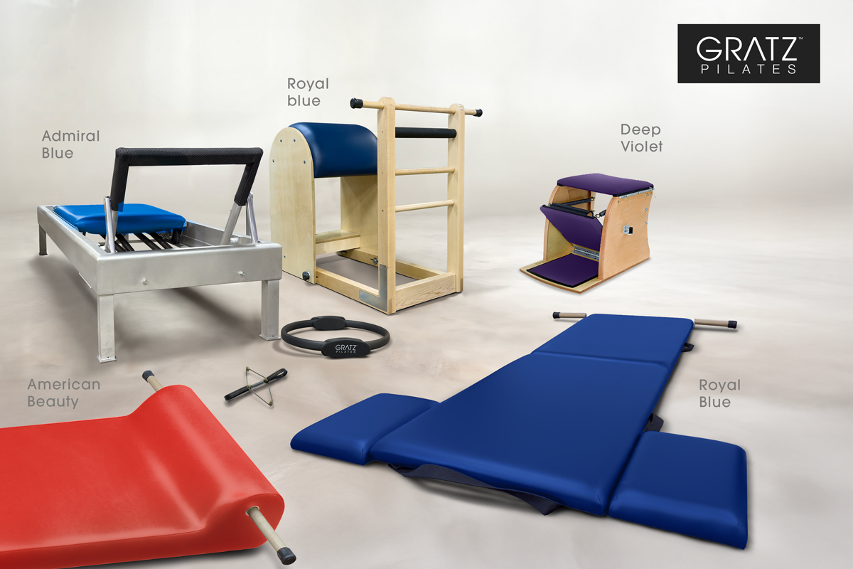
5. The Bold Movement Lab
Colors: Royal Blue, Admiral Blue, American Beauty, Deep Violet
Final Reflections: Building Your Chromatic Legacy
Pilates is personal, both in relationship building and for your own journey. But when you're a studio owner, it’s also professional. Your upholstery becomes part of your brand’s visual identity. In today’s digital age, what you choose will appear in every photo, every social media post, every memory your clients make. Selecting the right palette ensures cohesion between your values and your visuals.
Will your clients describe your space as Classical? Earthy? Minimalist? Energizing?
Selecting a color isn’t a one-time design decision—it’s a legacy choice.
It tells them who you are, what you value, and how you care for the experience of every person who walks through your doors.
Choose with purpose.
Design with clarity.
Stand apart with Gratz.
- List
- Map